What patterns, colors or materials are trending for summer?
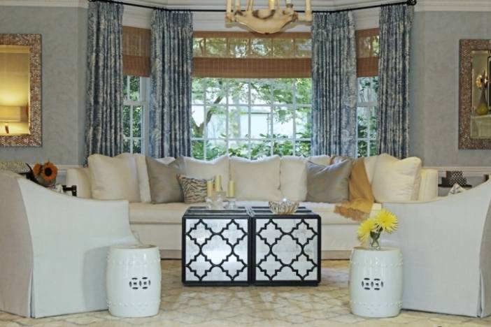
Muted tones and neutral palettes continue to trend, frequently accented by bolder colors in various shades of blues, greens or pinks. We’re still seeing gray as a staple color, although the emphasis has been shifting from cooler grays to warmer grays.
Various shades of blue, from turquoise to navy, have been seen as accents all year and are considered very in vogue. Softer whites and blacks, a bit less contrast than seen in the past, have been gaining favor and remain timeless, whether being used separately or within a single palette.
Incorporating naturalistic design elements remains in demand—i.e. bringing “outdoor” elements indoors, as seen in “live edge," rustic and primitive wood furnishings, and “branch” themed lighting, mirrors, and accessories. Extending indoor spaces through to outdoor spaces and creating outdoor “rooms” continue on a popular trajectory.
Blending items with ethnic or primitive characteristics, such as Moroccan, Asian, or Indian-inspired fabrics and rug patterns as well as furnishings maintains a widespread presence, while f
lat weave rugs and unique statement lighting are continuing in popularity, as well as painting exterior doors in strong, bold accent colors.
What strategies would you employ in decorating an exceptionally cramped space (such as a studio apartment, a tiny living room, a small office, etc.)?
Here is a short list of the things I consider, and frequently use, when designing smaller spaces:
- I frequently select a lighter color palette and use continuous color, which opens up a space and visually expands how the room feels.
- I’m extremely conscious about selecting furniture that is appropriate in scale and proportion for the room. Oversized furniture tends to look cramped in small rooms, and too many tiny pieces can create clutter. Scale is particularly noticeable in a small spaces; the appropriate proportions will help make the room feel more spacious.
- Liberal use of mirrors as well as transparent furniture and surfaces can really open things up. Mirrors help bounce light around the room as well as “extend” the space visually. Transparent surfaces and furniture such as glass and Lucite have less weight visually than opaque surfaces such as wood or upholstered furniture, or solid walls or doors.
- Incorporate furniture that multi-tasks—pieces that can help keep small spaces organized and uncluttered while allowing for a shift in activities and use when necessary.
- If possible, I like to extend an indoor space through to an adjacent outdoor space, such as a patio or balcony, designing the outdoor space to function as another room or as an extension of the neighboring indoor space.


