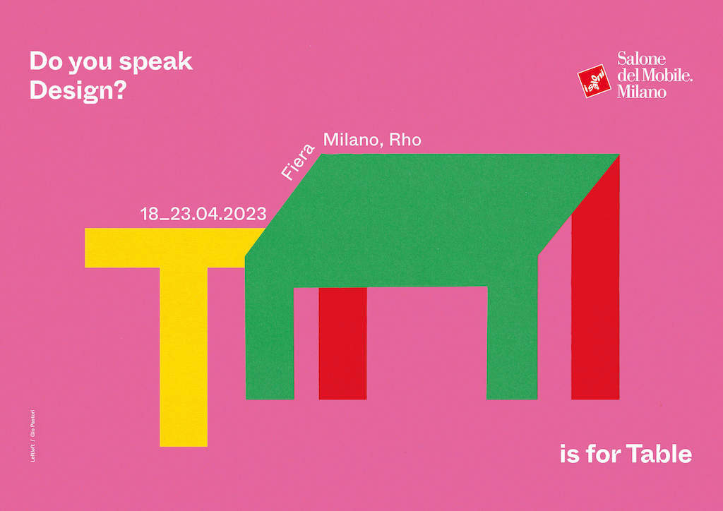
The 61st edition of Salone del Mobile, the largest design fair in the world, takes place in April 2023. Salone has engaged Milanese design studio Leftloft and illustrator and collagist Gio Pastori to create an inspiring concept representative of the show’s innovation and evolution. The concept pulls on originality and high design through the lens of the alphabet – Do You Speak Design? features 26 colorful posters each highlighting different elements of design.
Pastori is highly renowned in the Milan Millennial arts scene and is giving shape and color to the concept devised by Leftloft; together they have been tasked with condensing the identity, themes, and protagonists of the event, as well as its evolution into a distinctive and original visual narrative. Each of the 26 posters, one for each letter of the alphabet will be accompanied by an object or furnishing piece – A is for armchair, B is for bookcase, C is for chair… - directly interrogating the observer with the campaign – Do You Speak Design? is sure to make people think at different levels – contemporary and future, innovation, and continuity will be on the mind at the event.

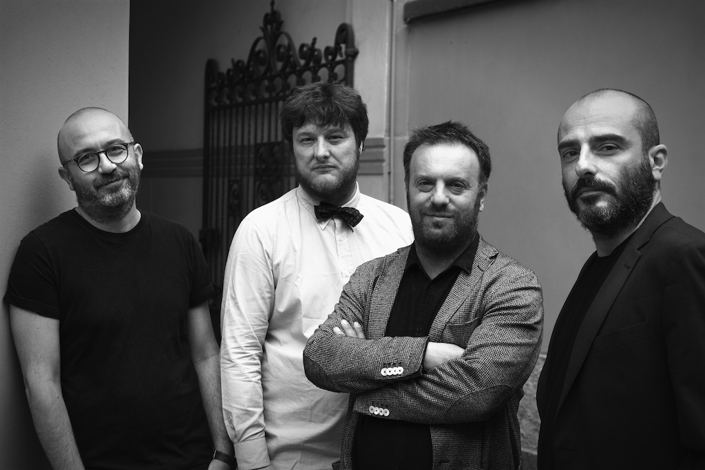
Leftloft Team
The inspiration for the campaign was triggered by a reflection on design itself and a want to go back and visit the basics: in a world and at a time such as this, design is everywhere – it can be seen, lived, enjoyed, channeled, loved, exploited and recycled. David Pasquali, co-founder and creative director of Leftloft said, “We felt the need to put the design taxonomies in order, a gentle and ironic order that, through an almost didactic encyclopedic approach, would shed new light on the fundamental phonemes of design, leveraging their sound, their meaning, their form and sequence to define, clarify, express and narrate.”
The idea of a new ABC or design was spawned, with archetypes and icons describing the protagonists of the Salone, around whom the Milanese design system revolves. A Munari-style directory – unexpected, never boring, simple in its originality, composed of absolute forms – bound up with the concept of simplification and synthesis – and animated by the use of light and pure, intense shades.

Gio Pastori
Once the concept for the design was chosen it was that Pastori’s insight, sensitivity, and talent that came in. “Illustrating an ABC of objects is a method that invites people living in Milan and all around the world to re-learn how to read them, to dig down into their souls unhindered by trends or brands,” said Pastori, “My take on it was to come up with a vivid color combination, disconcerting at times, to delay the immediate focus on the subjects. Essential lines and discreet volumes appear in a dreamlike, shifting atmosphere, dictated by erroneous perspectives and unlikely axonometries.”
The communication campaign will take shape and dimension in the daily and periodical press, within the web and digital world through social networks and out-of-home billboards. The 26 campaign posters will be revealed bit by bit, having already begun to be rolled out abroad and due to start in Italy in a matter of weeks.
