Expert interior designers can transform living spaces in several ways, one of which is making interiors appear larger than they are. We asked Haute Design experts how they go about making rooms larger than they seem.
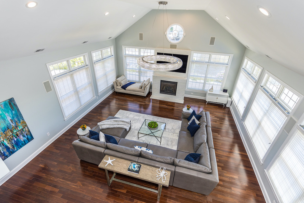 Photo Credit: @propertytourzz
Elizabeth Cinquini
To design a space that feels larger, Scale and Proportion is most important. The size of your furniture pieces and how they relate to each other, as well as the scale of your lighting, artwork, area rug, windows and color on your walls all affect how you feel in a space. White walls and white trim together actually make your space smaller, adding a contrasting color will give your room more dimension. Also, when it comes to artwork and lighting, if you choose pieces that are too small, your room will feel smaller.
Knot + Tide Interiors
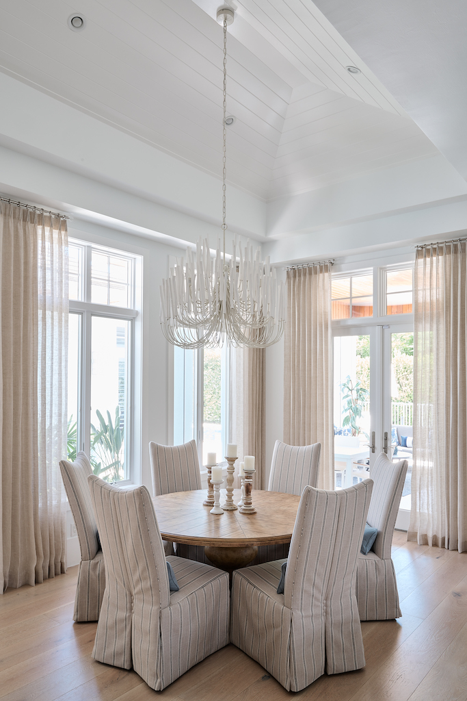
- Adding vertical wall details lets us draw the eye up and naturally create height. Elements like vertical shiplap, high millwork, or wallpaper with a vertical pattern can be great ways to make walls seem taller and more spacious.
- Including drapery panels in your design can tie together a room and make it seem larger in the process. Placing them just below the ceiling and all the way to the floor will create lift and length while providing a beautifully soft visual texture.
- Furniture scale matters! The most eye-level way to create a larger space is through the layout and size of the furnishings. If the selected pieces are too small, the room will feel HUGE — like it has swallowed them up. And vice versa, if they are too large, they can make the space feel cramped, tight, and uncomfortable. Finding that sweet spot in between is what makes a room work!
Leslie Saul & Associates
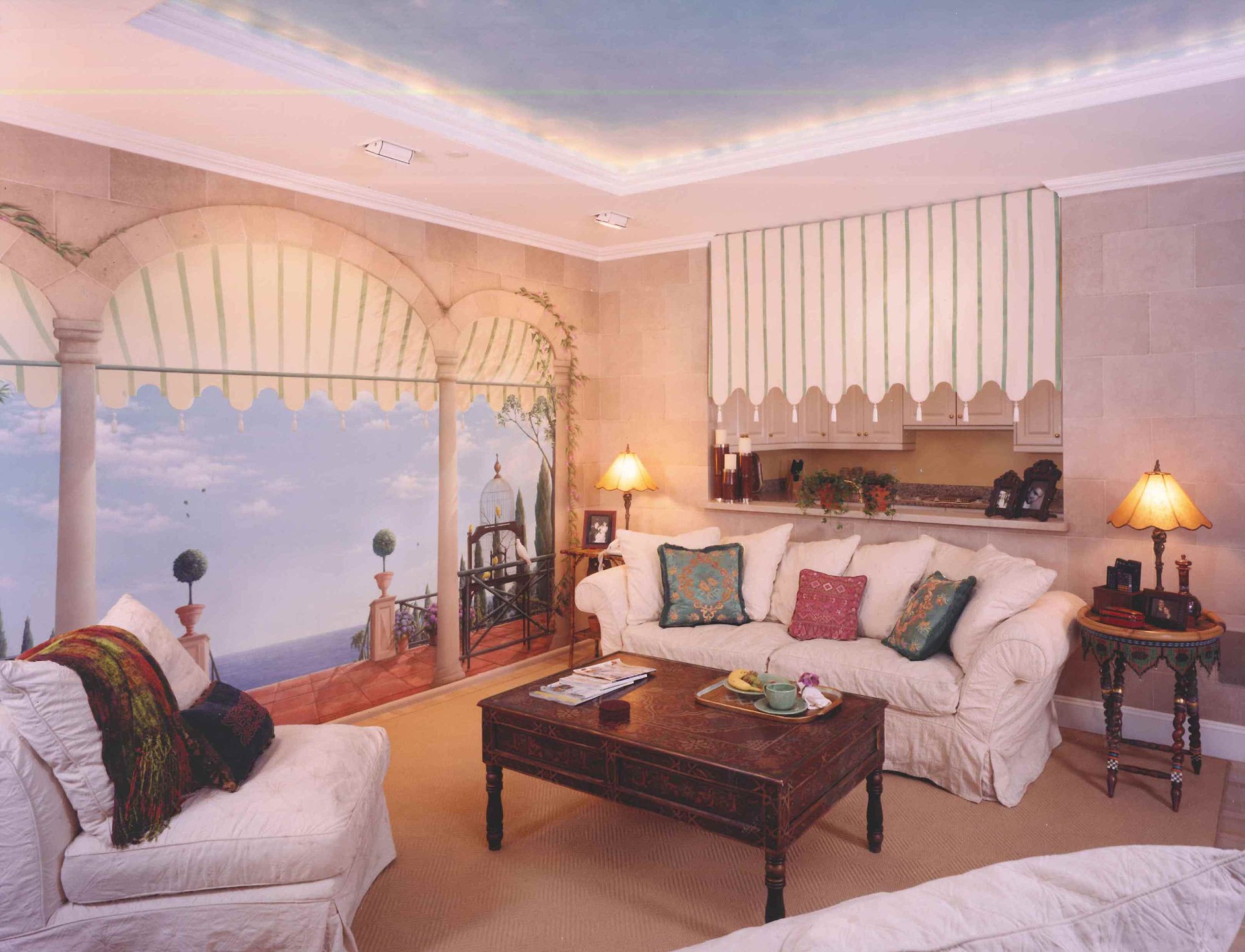
- Open up a wall, add a bigger window, paint a view. Views of the outside or into other rooms, whether real or not, make spaces feel larger than they are. In the above photo, we hired an artist to paint the view and then made a valance that hides the kitchen and enhances the illusion.
- Add a sliver (12 inches wide by the height of the wall) of mirror to the wall directly perpendicular to the window. Your eye will be fooled that the windows continue beyond the wall, an optical illusion that surprisingly works! Larger expanses of mirror do not work, primarily because if you see yourself, you know it’s a mirror.
- Direct the eye away from the walls. That means if you paint the walls and upholster the furniture in a soft monochromatic neutral, you will get an amazing effect from a bold piece of art or pillow on the sofa in a bold color. You will notice the accents more, and the size of the space less.
- Be selective and curate what you put into a small space. Lots of small pieces of furniture and “tchotchkes” will be busy and feel claustrophobic, whereas a few normal sized furniture, fewer extra items, and a sense of quiet, will expand the feel of the room. Take things out!
- Go for it. Paint the walls and ceiling in a high gloss saturated color (the opposite of #3). If you have the confidence to try it, it will be a room that not only makes a statement but it will be a place that makes the rest of your house seem bigger. This is a great idea for that extra den, not necessarily for your primary living space.
The Nielsen Collection
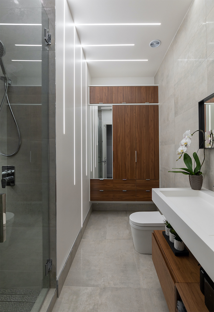
We design an open and airy feeling to expand the perceived space, by using natural and neutral tones throughout. Large plank wood or large format tiles, in a neutral color, will keep the space from appearing too busy. We like to layer with texture, as opposed to bold patterns and stripes to create less contrast. If your space is small stay away from heavy drapes, instead opt for gauzy or linen fabrics to avoid adding weight to the room. Last, but not least, furniture should be scaled appropriately and off the floor (legs), allowing an abundance of light to flow through the room. Luminous objects and acrylic pieces work well as they reflect light. This design can work just as well for small bathrooms by using floating vanities and large lighted mirrors. In summation less is best when you have a small space. Have fun designing with neutral colors, layers of texture, and light weight fabrics.
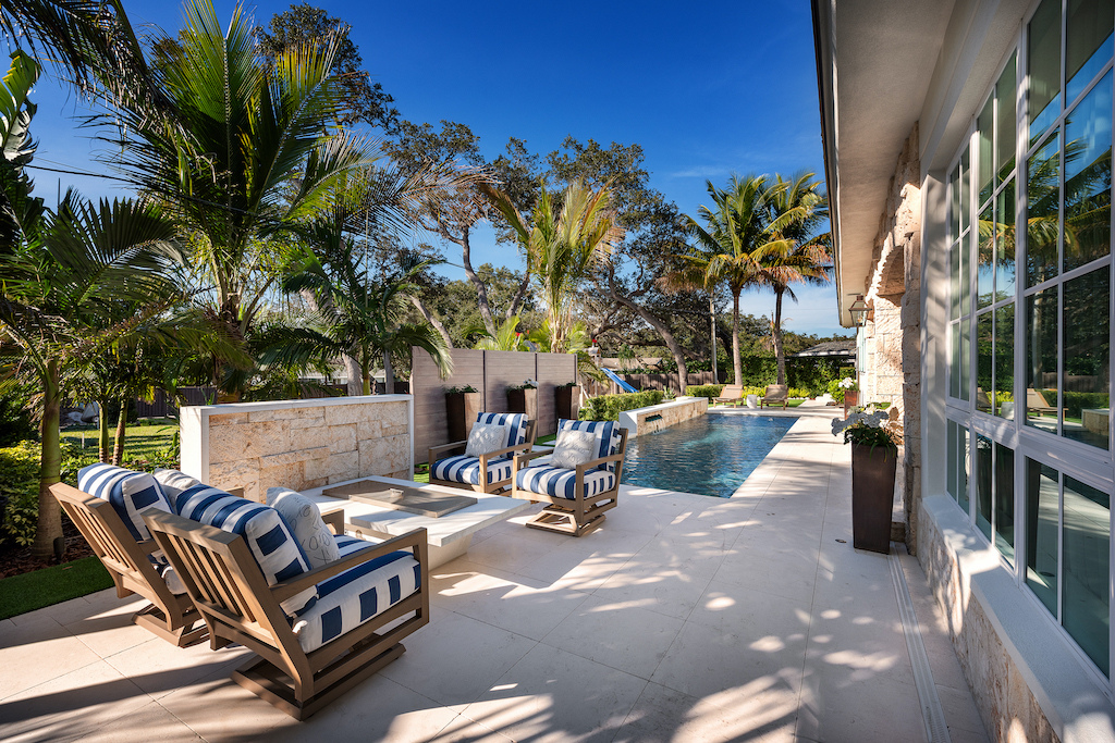
Ryan Hughes Design Build
Although the sky may be the limit in the out-of-doors, exterior designers like Ryan Hughes Design Build are often tasked with expanding the feel and function of outdoor spaces with limits. “The key to creating a larger feel and a sense of openness is found in executing a plan that stays away from the use of elevation changes or dark vertical features that can close off a design,” said Ryan Hughes. A selection of lighter colors in surfaces to fabrics or sleek and minimalistic textures in tiles to furnishings also can create a visually open feel to a design plan, indoors or out.


