A Fort Lauderdale couple undertook the remodel of a canal-side home cloaked in neo-Mediterranean and West Indies trends. Underneath the layers of bygone trends, the home boasted impressive bones. The couple enlisted our team to help realize the kitchen. Alongside their interior designer, Kelly Marie of Kelly Marie Interiors, they could see the dormant potential in the entire home all along. The end result is a home that is every bit welcoming, relaxed, chic and timeless. The spaces are flooded with natural light, establishing a relationship between the indoors and outdoors, heightened by the interior choices.
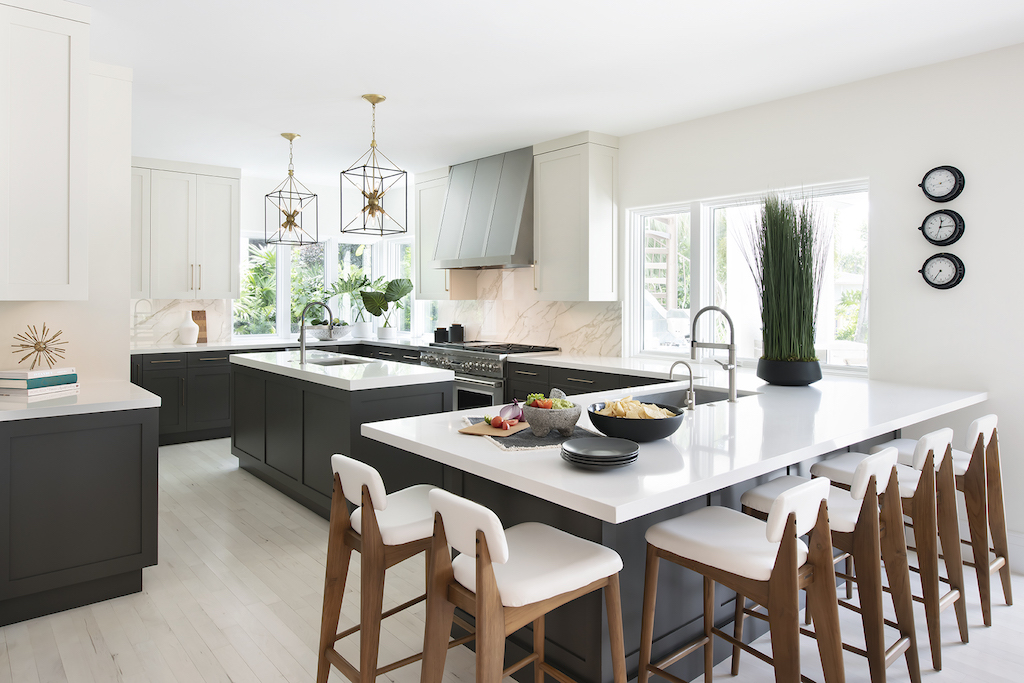
The existing oak floor was bleached to a white-washed tone. The walls were coated in an ever so slightly creamy shade of white that radiates brightness and warmth. The cabinets are finished in a powerful balance of contrasting colors- a taupe-y off-white and a show-stopping brown-grey hue. The dark color is a bold and refreshing choice that deviates from readily used neutrals, a choice that makes all the difference. This new kind of neutral sets this kitchen apart; it has a commanding presence that completes the warm scheme. The countertops are white quartz, albeit not the starkest of whites. The hardware is a brushed brass, reminiscent of a soft casting sunset glimmer. Every finish holds a warm undertone, carefully selected to be discernibly crisp- a more contemporary take on a neutral palette.
The kitchen layout follows much of the original footprint. The location of the kitchen, already having an open plan surrounded by windows overlooking the lush landscape beyond, the pool and waterway, was an attribute that made this home a hidden gem. There was no need to move the location of the kitchen to another part of the home and undertake extensive renovation.
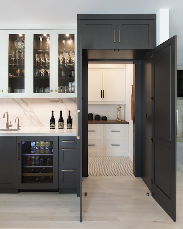
Perhaps one of the most impressive elements in the kitchen is the dining built-in. This piece is comprised of a working tall pantry cabinet flanking the left end and a matching false pantry cabinet to flank the right end. This false cabinet is made up of tall doors to disguise the entry into the pantry room. The built-in is meant to read as a symmetrical piece that occupies the focus of the wall. It keeps the composition of cabinetry as clean as possible without the visual break of an opening. The center section of the built-in features glass door cabinets with doors in the contrasting finish, a continuation of the two-tone contrast concept in the kitchen.
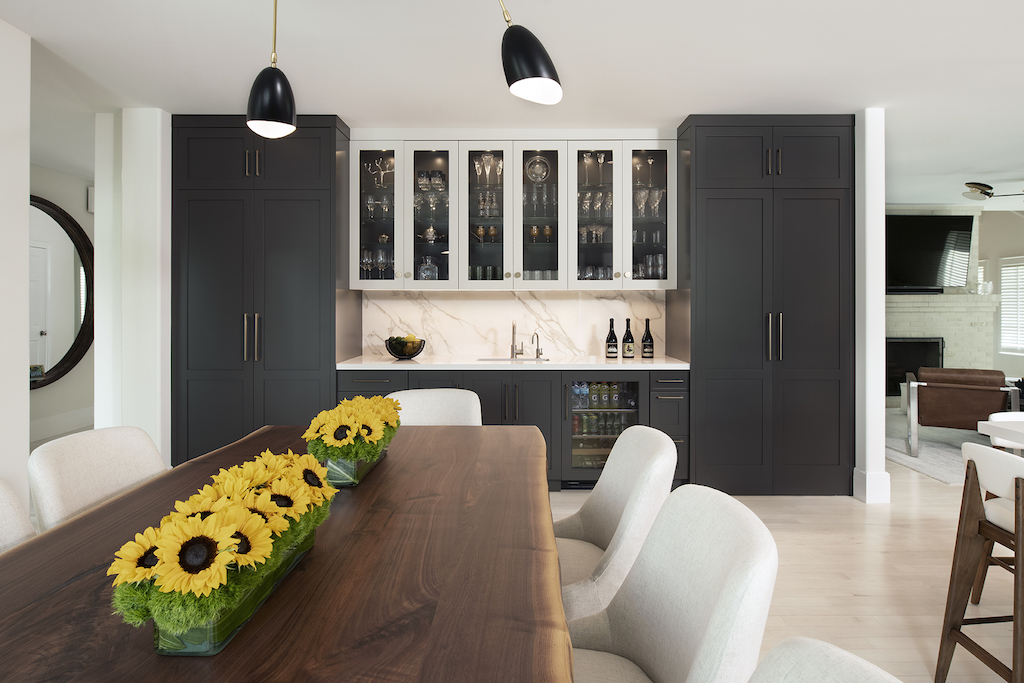
The cabinets in the kitchen and dining area keep these two spaces reading as an extension of one another. These are supporting elements, part of a remodel impeccably and tastefully done, but most of all, successful because it reveals everything that this home had to offer.

