Mirrors have the ability to serve a wide variety of purposes, especially when it comes to design. They have the power to widen a space, add a touch of edginess or fun, or simply provide that last-minute “check” just before heading out the door. Here are five extraordinary ways mirrors have been used to completely transform a structure or surrounding space.
#1: Rotating Splendor
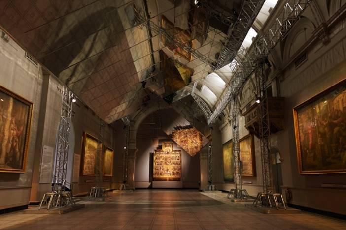
Two, gigantic rotating mirrors installed inside the Victoria and Albert Museum have collectively been described as an “experience,” as opposed to actual objects.
The impressive structure—built for the 2014 London Design Festival by Edward Barber and Jay Osgerby—reflects paintings in the museum’s Raphael Gallery. The two, enormous panels resemble the appearance of airplane wings, and are suspended just below the vaulted ceiling. Each of the two structures moves independently from one another, and pivots around a central, horizontal beam. The mechanism turning them is hidden from view.
#2: Creative Viewpoint
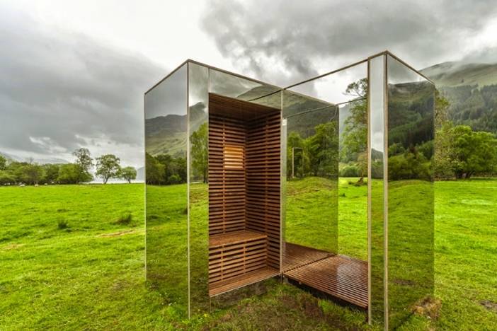
Two architecture students creatively used mirrors in their design of this “lookout point” in a Scottish national park.
During their final year at Glasgow’s Strathclyde University, Angus Ritchie and Daniel Tyler built what appears to be a mirrored cabin called The Lookout, which perfectly blends in with its picturesque surroundings. The wood-framed structure has built-in benches placed at different elevations, aimed at framing different views in the landscape.
#3: Funhouse
Just a few added mirrors transformed this regular house into a fun, playground pavilion for young students.
Danish architects MLRP designed the Mirror House as part of Copenhagen’s Interactive Playground Project. Mirrors were affixed to the gabled ends and doors of the structure, similar to that of a funhouse, allowing children to view their amusing reflections at recess. The building serves as a flexible space and restroom for kindergarten classes.
#4: The “Reflective” Slide
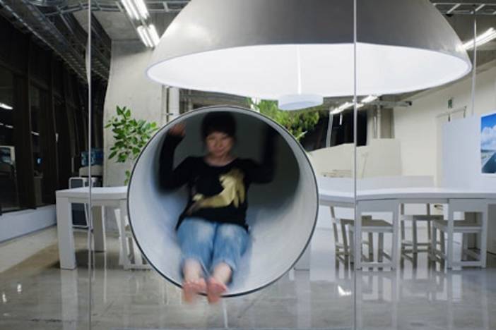
No need for stairs at this Tokyo office. Employees use a slide to return to their workspace.
The slide is hidden behind a mirror-covered wall designed by Japanese studio Schemata Architecture Office, which also helps to elongate the space. The slide's entrance shoot can be accessed by climbing up a ladder to a partial second level, used as a storage area and restroom. The office additionally features a dome-shaped reflective lamp (seen above in the mirrored wall), which hangs over a meeting area and is over 11 feet in diameter.
#5: Breathe Easy
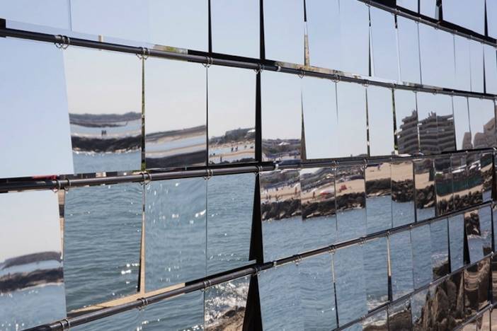
This structure called Breath Box has 300 mirrored “flaps” that are lifted up and down by the breeze.
Montpellier studio NAS Architecture designed the pavilion in La Grande Motte, France for the Festival des Architecture Vives, a French design competition that takes places every summer. Designers Hadrien Balalud de Saint Jean, Guillaume Giraud, and Johan Laure sought to create a structure that both reflects the scenic location, and works well with the coastal wind. The final product features a billowing façade that gently moves with the seaside gusts.
Photos and details courtesy of Dezeen


